Stock Prediction and Anomaly Detection 📈
The goal of this project is to get familiar with financial data, review basic time series forecasting and anomaly detection. The project’s main objectives— prediction stock price trends and identifying unusual price movements— are easy to understand and measure. I will also create a simple liquidity score based on trading volume and price volatility, which will give me insight into how liquidity affects price stability.
We need the following imports:
import yfinance as yf
import pandas as pd
import numpy as np
import matplotlib.pyplot as plt
The first section is data collection and preparation. I use the Yahoo finance API to gather daily stock price and volume data for MSFT (microsoft) over a two year period.
Part 1. Data Collection and Preparation
# fetch historical data
ticker = yf.Ticker("MSFT")
# print(ticker.info)
data = ticker.history(period = "2y")
Here is an example of what the data looks like:
                                 Open        High         Low       Close    Volume  Dividends  Stock Splits
Date
2022-11-08 00:00:00-05:00  224.824170  227.724173  222.012638  224.991287  28192500        0.0           0.0
2022-11-09 00:00:00-05:00  223.516686  224.755342  220.528212  220.705154  27852900        0.0           0.0
2022-11-10 00:00:00-05:00  231.440116  239.206242  231.017410  238.862167  46268000        0.0           0.0
2022-11-11 00:00:00-05:00  238.872022  243.787287  237.829974  242.922195  34620200        0.0           0.0
2022-11-14 00:00:00-05:00  237.888951  239.776411  235.156066  237.456406  31123300        0.0           0.0
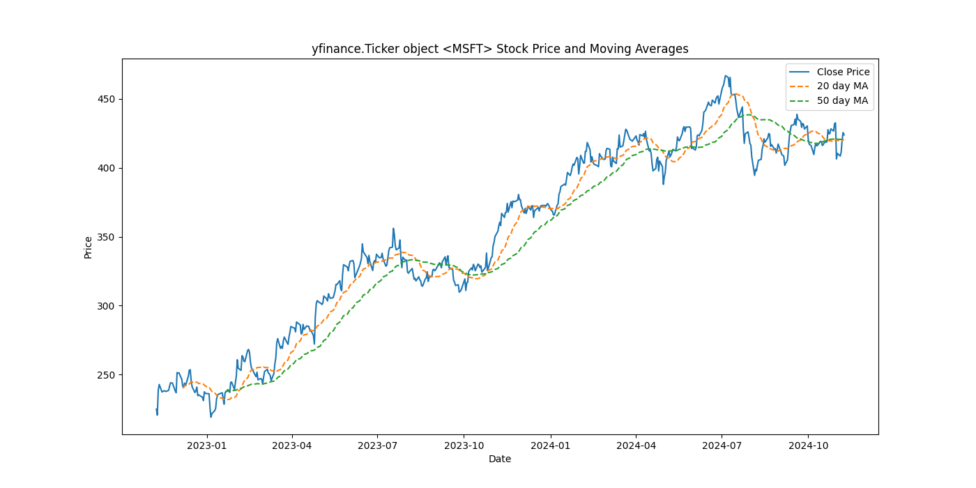
The next step is to do some exploratory data analysis where I will plot the stock prices, calculate the moving averages, and calculate price volatility.
Moving averages are used to analyze data points over a certain time period in order to smooth out short term fluctuations and highlight longer term trends or cycles.
# calculate 20 day and 50 day moving averages
data["20_MA"] = data["Close"].rolling(window=20).mean()
data["50_MA"] = data["Close"].rolling(window=50).mean()

print(data.tail())
Here is what the tail end of the data looks like:
                                 Open        High         Low       Close    Volume  Dividends  Stock Splits       20_MA       50_MA
Date
2024-11-04 00:00:00-05:00  409.799988  410.420013  405.570007  408.459991  19672300        0.0           0.0  419.661501  420.520801
2024-11-05 00:00:00-05:00  408.369995  414.899994  408.079987  411.459991  17626000        0.0           0.0  419.499001  420.480201
2024-11-06 00:00:00-05:00  412.420013  420.450012  410.519989  420.179993  26681800        0.0           0.0  419.635001  420.607001
2024-11-07 00:00:00-05:00  421.279999  426.850006  419.880005  425.429993  19862800        0.0           0.0  420.114500  420.903600
2024-11-08 00:00:00-05:00  425.395996  426.500000  423.058197  423.663391   5727178        0.0           0.0  420.481670  421.114468
Part 2. Visualize Stock Prices and Moving Averages
plt.figure(figsize=(14,7))
plt.plot(data["Close"],label = "Close Price")
plt.plot(data["20_MA"],label = "20 day MA", linestyle = "--")
plt.plot(data["50_MA"],label = "50 day MA", linestyle = "--")
plt.title(f"{ticker} Stock Price and Moving Averages")
plt.xlabel("Date")
plt.ylabel("Price")
plt.legend()
# plt.show()
Plotting the moving averages helps to understand general trends and smooth out noise.

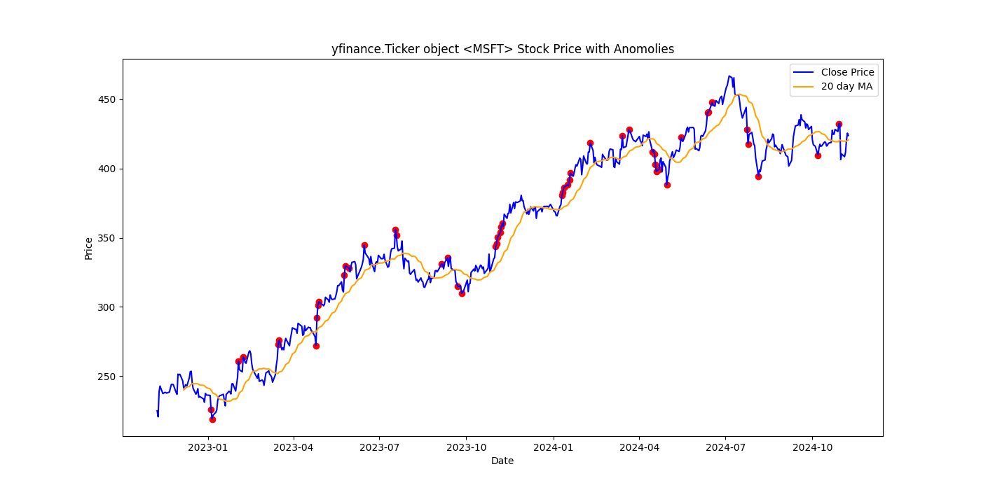
Part 3. Simple Anonomly Detection
I will define an anomaly as a day when the stock prices deviates significantly from the 20-day moving average. Any price that is more than two standard deviations away is flagged as an anomaly.
# calculate the rolling standard deviation
data["20_STD"] = data["Close"].rolling(window=20).std()

# anomalies will be prices that are more than 2 std from the ma
data["Anomaly"] = np.where((data["Close"] > data["20_MA"] + 2 * data["20_STD"])|
                           (data["Close"] < data["20_MA"] - 2 * data["20_STD"]),True,False)

# plot anomalies
plt.figure(figsize=(14,7))
plt.plot(data["Close"], label='Close Price', color = 'blue')
plt.plot(data["20_MA"],label = "20 day MA", color = "orange")
plt.scatter(data[data["Anomaly"]].index,data[data["Anomaly"]]["Close"],color="red")
plt.title(f"{ticker} Stock Price with Anomalies")
plt.xlabel("Date")
plt.ylabel("Price")
plt.legend()
# plt.show()

Part 3. Simple Liquidity Scoring
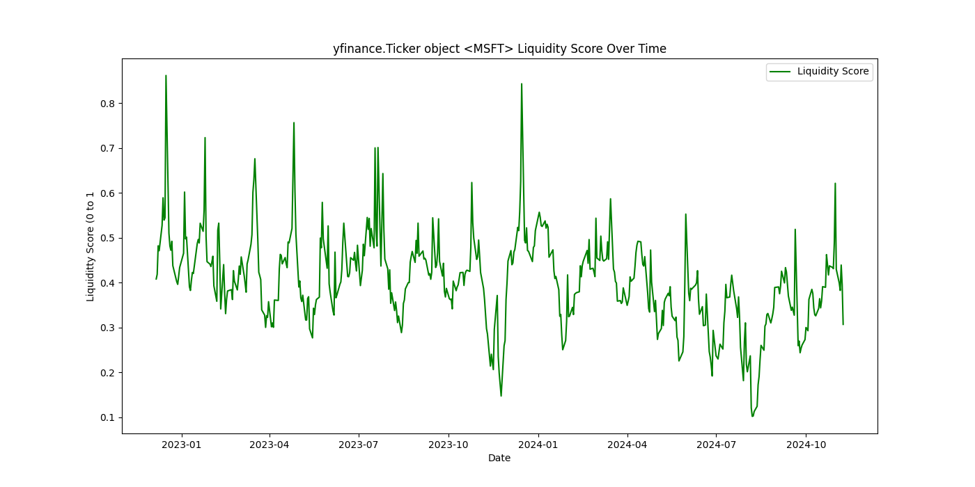
The score will be based on daily trading volme and price stability. Higher trading volumes and lower volatility indicate a higher liquidity. The volume and volatility features are normalized and averaged together to produce a liquidity score.
# normalize trading volume and rolling volatility
data["Volume Score"] = (data["Volume"] - data["Volume"].min()) / (data["Volume"].max()- data["Volume"].min())
Volatility is the standard deviation of price changes. It represents the degree of price fluctuation First, normalize the volatility and then subtract it from 1. By doing this, assests with lower volatility get a score closer to 1, indicating higher liquidity and conversely.
# higher stability = higher score
data["Volatility Score"] = 1 - (data["20_STD"] / data["20_STD"].max())

# calculate simple liquidity score
data["Liquidity Score"] = (data["Volume Score"] + data["Volatility Score"]) / 2

# plot liquidity score
plt.figure(figsize = (14,7))
plt.plot(data["Liquidity Score"],label = "Liquidity Score", color = "green")
plt.title(f"{ticker} Liquidity Score Over Time")
plt.xlabel("Date")
plt.ylabel("Liquiditty Score (0 to 1")
plt.legend()
plt.show()

This project can be further extended by using machine learning models for more complex forecasting or anomaly detection tasks.